Sunday, July 3, 2011

SUGAR AND SPICE


Hi this is my take on the June Blog Hop sketch over at Pages In Time. Hope you like, below I will post pics of the different things we had to do along the way. Thanks for stopping by!!!

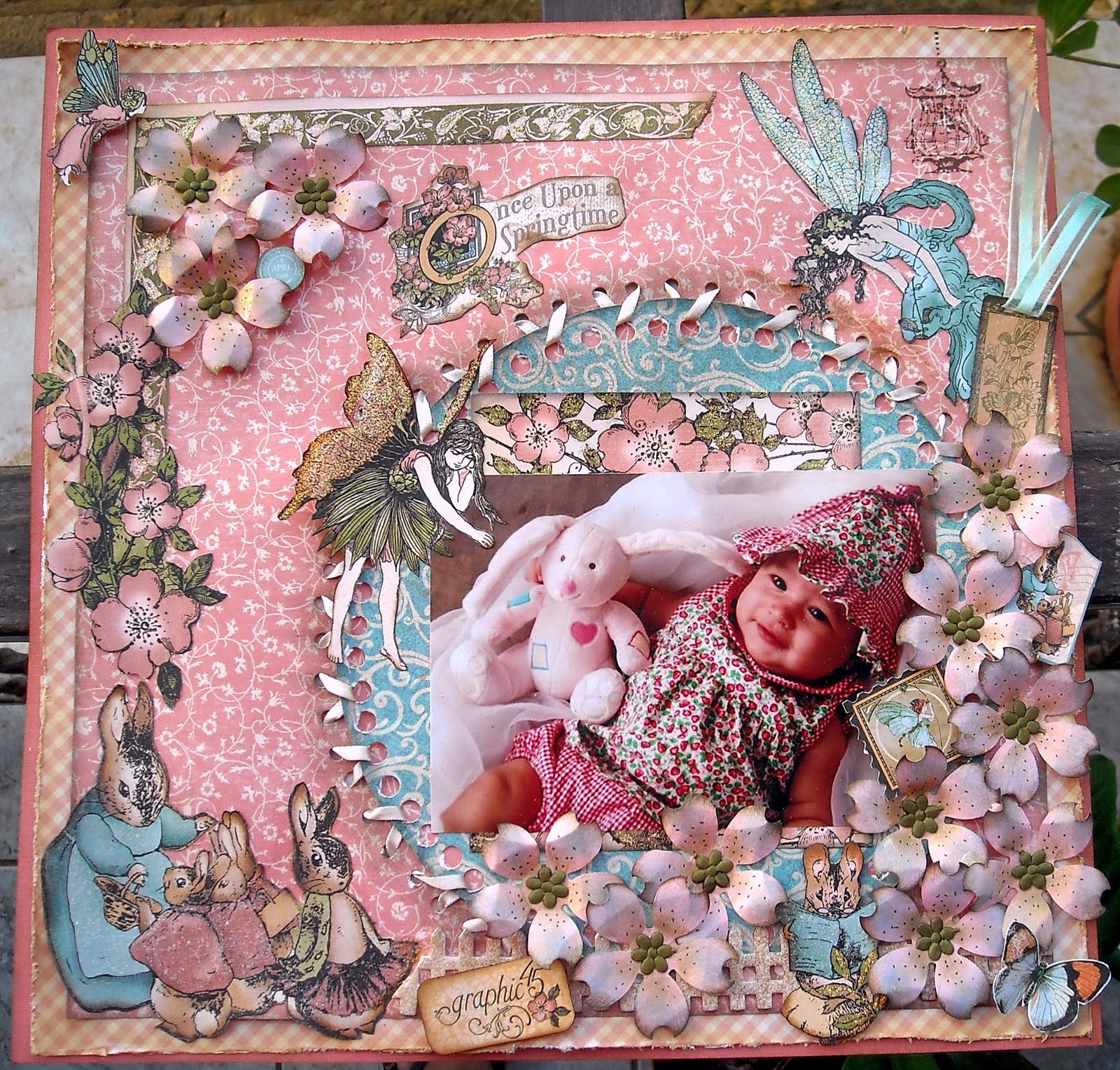
Here you can see four of the steps we had to do
1-Becky's distress edges, I did both tear and ink
2 -Lisa's matting the pictures
3 -Anna C. border punch that I added liquied pearls
4 -Andrea's Stitching

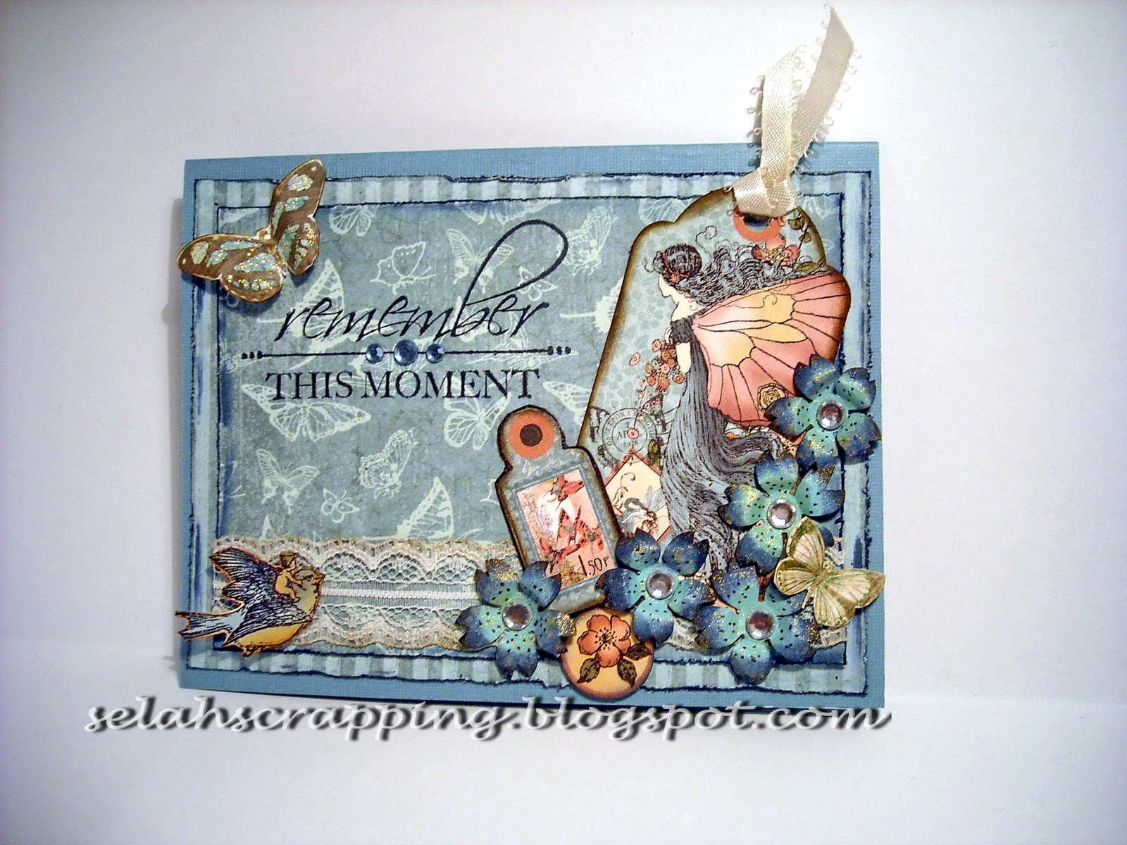
In this pic you can see two of the other steps
1 -Jessie's hand made flowers
2 -Lili's Journaling

 And here you can see one of the steps which is Traci's Stamping the Title. 

Well I hope you all liked my project and remember to stop by all the members that participated's blog to see there step by step tutorial's, I'll post the links to there sites below, thanks again bye!!!

Karen: http://fablady.blogspot.com/ (sketch)
Becky: http://manyminimemories.blogspot.com/ (distressing & inking)
Lisa: http://theshabbyhorse.blogspot.com/ (Pictures: Mat picture and doodle on the edges)
Anna C: http://picturesnpapers.blogspot.com/ (Border Punch)
Jessie: http://disasterouscrafting.blogspot.com/ (Flowers-plans tutorial)
Stacey: http://ohschwietscrap.blogspot.com/ (Faux Flourish)
Andrea: http://dreasscrapsofinspiration.blogspot.com/ (Stitching)
Traci: http://scrapsofwhimsy.blogspot.com/ (Title - Stamping or doodling on the letters)
Lili: http://pagesintimestoresite.ning.com/profiles/blogs/pages-in-time-interactive-blog


Saturday, July 2, 2011

"There's an Inter Active Blog Hop Over on Pages In Time"

Hi everyone, over at Pages in Time we're having a "Blog Hop". It's super exciting to see what is going on. It's so simple, just follow along and at the end someone will a yummie prize. Take a look at what you can win if you participate;

So all you have to do is start off at Karens blog which is http://fablady.blogspot.com/ , there you will find the sketch to the layout that  you will be doing. From there, we will be giving you the link to the next blog where you will do the next step in your layout. It's so much fun, to see what everyone will do. For better details you will find them at the first start which is Karens blog. 
So go running to the first step and then each blog will take you to the next and along the way what you have to do to complete the sketch. Wow, working on mines now. 
GO GO GO, times running out!!!

Tuesday, June 14, 2011

All Occasion Card


Hi, this is for a colour challenge over at Pages In Time. We had to use pink and yellow, my pink is not that pink but its as close as can go, lol. 

Here I used Crate Papers Portrait Collection and just matted with pink and yellow under. The butterflies are from the Gabrielle collection from Bo Bunny. The tag on top is from the Once Upon A Springtime from Graphic 45.

Pretty simple, if you have any question just send me a message or leave a comment, thanks for looking......Selah!!!

Happy (PIT June 09 sketch)


This is the sketch from Pages In Time for the June 09, go check out the site they have such wonderful sketches.


Hi, this is may take on the sketch, this was sooooo much fun to do. The colours we a challenge for me because there not in my safe zone, but little girls should get there bright colours now and then, lol. 

Tried a new technique I saw and loved it which is dry painting acrylic on the paper and writting on it, awesome.

So simple to do just don't add water to the brush to and just plain acylic paint, thats what will give you that sort of broken up part in the paint to make it look old. Love it!!!

Well I hope you liked it, if you have any question just leave me a comment. Don't forget to visit Pages In Time, you'll love it. Thanks for stopping by!!!!


Saturday, June 4, 2011

Thank You!!!


Thank you to all of you that have come to my blog and commented or have just come to see. I appreciate all the support, many blessing and lets keep on Scrappin!!!

Monday, May 30, 2011

THOSE EYES


Hi, this is a layout I did of, again, my bbf's little girl. I tried to step out of my safe zone here with all the tones of pinks and bright green. Hope it came out okay, lol. This is for the May 26 sketch over at Pages In Time.

  1. Just two layers here, first is regular textured dark pink card stock. The second is a paper I brought at my local scrapbooking shop but again for the life of me I can't remember the name of it, so sorry about that one....ah....I did it again. 
  2. I then took a paper trim cut it up punched some holes in it and weaved the ribbon through the hole. This technique mind you is not of my own invention, lol, its a fabulous style from Grabrielle Pollacco. She's just such a talented person, love her work. On the side column of my blog is her blog site, just click and it will take you direct. Then I added a string of pearls to give it that shabby chic look to it and where the space is from weaving the ribbon I glued a flower.
  3. Then I took a scallop circle, inked the edges and punched holes close to the edge. Put some bling I have and placed it behind the photo.
  4. Under the photo I placed a liked peach coloured paper that I then trimmed with lace at the edge of the photo.
  5. I took three strips of mint green, soft pink and light olive, stamped them with a swirl style clear stamp in black Staz-on ink and inked the edges of the strips with Black Soot distress ink. I then turned down the corners in a ladder style to give it dimension. Fancy cut some fairy's from the G45 collection Once Upon A Springtime. The bunny, little mouse and bird are also from that collection.
  6. The flowers are from my own stash.
  7. The title is from the Cricut cartridge "George Basic Shapes" in dark brown cardstock.
  8. The fairies wings and the edge of the flowers where the ribbon is are painted in Stickles  in Diamond.
Well, I hope you've like my layout, if you have any question just leave me a comment and I'll get back to you, thanks for stopping by, Selah!!!

Sunday, May 29, 2011

POST CARD TIN


Hi, thanks for stopping by. Here is a post card tin box I did for the DT challenge over at Pages In Time, its a wonderful site so go check it out, I'll post the link at the end. The challenge was to do a project, could be anything that incorporated a post card. So here is my take on the challenge.


  1. First I took a Maya Roads tin box where some clear stamps came in and alcohol inked the box inside and out in Expresso brown. Then I did some crackle paint on the outside in white acrylic paint. Can be any white acrylic paint, the one's you buy at your local department store in the hobby section. Then I went over it lightly with some Ranges Distress ink in Vintage photo. 
  2. I then took a strand of pearls and hot glue gunned it on the outside edge of where the transparent acrylic meets the tin. Super easy and it just give it that super touch.
  3. Then I look some beautiful lace I just brought and glossy accent it to the inside part of the acrylic, note when working with transparencies its best to use glossy accents, hot glue guns just melt it away and other glues can leave a visible residue.
  4. I fancy cut and image for the Graphic 45's pp collection "le romantique" and glossy accented that image to the inside part of the transparent acrylic. I just love how the image of the lady is looking at something and we see just her back, perfect for the effect I was looking for to give it dimension.
  5. The flowers on the outside are from my personal stash of flowers I had of when I did hair bows for little girls. I took some that would go well in the overall colour and then took some little rose buds and did a spay of it top and bottom of the tin to sort of fame it. The little swirly wires are just the wire stems for the two big flowers I used. Doing that give it more interest and is great for filling in spots and not using up more flowers.
  6. The butterfly again is from the "le romantique" collection form G45.
  7. The inside. Well, I didn't have any post cards so I made my own from manila folder sprayed in Walnut Glimmer Mist from Tattered Angels and then edged in Walnut Stain distress ink. I then stamped a post card style stamp on it and some other little detail stamping to give it that post card look and gave it some faux stitching all the way around to sort of frame it.
  8. The image in the center again G45 le romantique that I fussy cut it. The stamp in the left corner is just some stamp images that I googled and printed out on card stock and 3D glue dotted on the post card.
  9. I did a sort of faux cameo by cutting out an image from the G45 le romantique papers. I then inked the edge of the oval piece in Black Soot distress ink and UTEE heat embossed it three times to give it that sort of raised glass effect. You could of cracked the UTEE when it dried and then distressed inked the top and that would of given you a whole other effect, really great. But since the background of the image was already dark I just left it uncracked. Then I cut out a piece of dark cardstock in the same size as the image and glued around the paper some lace trim I had. After I then glued on top of that the image and for me it looks like a little cameo.
  10. The key is some light weight chipboard cut out of a Tim Holtz die, I think its called Hardware Findings.
  11. I then took the key shape and heat embossed it in Vintage Photo distress embossing powder, so great these powders to do distressed metal looks super recommend it. Embossed it, inked the edges black and then took some Dew Drop ink pad in Lightning Black and with my finger just gave it a touch here and there. 
  12. The ribbon is white organza that I glimmer misted in Walnut Stain and heated up to give it that old crinkled look. Its great to heat it up, the heat if you leave it long enough will not only wrinkle the organza ribbon but will also give it like little holes at a point, great, seems like moths were eating it up because its old and all, lol. Didn't do it here because the space was so limited it would show well, but on a card, tag or layout, wow, looks fab.
Well thanks again for stopping by, hope you understood my "small" description. Any questions just leave me a comment and I'll be happy to answer. Blessed day, Selah!!!!

http://pagesintimestoresite.ning.com/

Monday, May 23, 2011

UNITED


Hi, oh boy this one was a stumper, lol, got blocked half way through, but got my mojo goin again, lol. This is a layout I did of my neighbors kids, theres like cats and dogs sometimes says there Mom but there always united by love.
  1. Okay, first layer is regular textured cardstock in light teal blue.
  2. The second layer is bright teal textured cardstock that I distressed. Then I used a border punch from Friskars, but sorry don't know the name of the actual style, again!!! I inked all the edges in distress ink Walnut Stain.
  3. On the top layer I used the Bo Bunny paper collection called "Gabrielle" it's sooooo scrumptious but so difficult for me to work with, I love complicated.....but uffff......lol, anyway, tried, tried to keep it simple.
  4. I turned the paper and used the butterfly design down and cut the edge of the butterfly and stuck the photo under, then used trim around the photo.
  5. The title is from cricut cartridge "Heritage" in size 1", and the corners are from the same cartridge in size 2". I took brown cardstock added crackle medium then painted white, when crackled I dry washed it with blue and teal inks and then used distress ink in vintage photo on the top and black soot on the edges of the corners that I cut out of the cartridge.
  6. The butterflies I just cut out of the same design paper. 
  7. The stick pin is one I made from my stash of beads of when I do jewlery.
  8. And last but not least the flowers are done by me from my Ek Success punch in Retro flower in medium and x-large. Painted with dew drop inks. The border trim is in a little pearl rope I brought at my local department store, hope it added that little touch, lol!!!
Thanks for stopping by and looking if I left something out or have anymore question just leave me a comment or email me. Thanks again!!!

TOGETHER


Hi, here's another layout I did of my bbf's little girls, theres so always together, so the titled seemed appropriate. First time working with big lacy trim, so I hope it worked out.
  1. First bottom layer is just regular textured cardstock in olive green.
  2. The second layer which is the middle paper is from Graphic 45's Once Upon a Springtime collection. I distressed the edges and then inked them in rangers distress inks in Crushed olives and Walnut Stain.
  3. The top layer is bright light green textured cardstock that I distressed and ink in Walnut Stain. Then I took some water and mist the two opposite corners. Lightly top and bottom of the paper, in the corner. Then started to scrunch the edges in held it in place with a clothes pin and heat dryed, that made it really hard and stayed exactly how I molded it. Took some ribbon in lemon yellow, made a bow and glued them on, helped hide some rips from the scrunching, its will happen so don't worry just adds to the feel of the whole thing, lol.
  4. I then stamped in the other corners a lacy border stamp from the Pink Paisely collection Botanical. The lines or little squares in the back of the pic is from Kaiser., The butterflies that are in black and white are stamps from Maya Road it's comes in a tin box, but for the life of me I cant remember the name, sorry did it again.
  5. The brown branch is from the cricut cartridge Home Decor, in size 3 inches.
  6. The butterfly cut outs and the fairies are from again Graphic 45's OUAS.
  7. The flowers are from EK Success punch "retro flowers" in x-large and small. I inked them and sprayes them with Tattered Angels "pearl", super great for flowers.
  8. Finally, the crochet trim is from my local department store here in Puerto Rico, I don't think there's a store in the states but the store is called "Capi" so check it out if you like, could be that your local department store may have them as well.
Thanks for stopping by and checking out my project, more to come. Thanks again!!!

Monday, May 2, 2011

DAYDREAM


Hi, this is a card I did for a colour challenge at Pages In Time. Wonderful site, informative and creative place where you can post your projects and get helpful insight on scrapbooking trends. 

Well the colour challenge was to be with teals, peach, beige, grey's and browns. Tried to do my best with the teal colour but I think it came out a little more bluish than green, oh well, close enough I hope, lol.

  1. The first layer is just bluish grey cardstock in a linen texture (the card itself). The second layer is cardstock in "teal" colour, lol in linen texture as well. On the edges I distressed inked it with "weathered wood" Ranger distress inks and blacksoot. Just makes it pop out with having to do another layer.
  2. The top layer is some pp that I found in my stash, but by the best of me I cant remember from what company or collection it is, sorry.....did it again......I promise I'll fix that big flaw of mine. I left it pretty simple, just distress inked the edges in "weathered wood, walnut stain and black soot", for the finish I sprayed it in Tattered Angels glimmer mist in "Walnut Gold".
  3. All the elements on the top that are vintage are from the Graphic 45's Le Romantique collection, just awesome papers....always....that I fancy cut out some details from different pages and layered on. I gave the card a little dimension by slightly off setting the detail off the edges of the top layer to give it a perception of dimension. Like for instance the ladie that is sitting down nex to the book, I left her shoes off the edge to the teal cardstock. Love how that came out, just gives it that little something.
  4. The 3-D puff flowers are punch outs from EK Success punch called Retro flower in small and the one they call whale of a punch. Painted them, bended them, wrote on them, inked them and whala!!! If you like my flowers and want me to do a tutorial, just leave me a comment and I'd be glad to. Sometimes I have a hard time describing what I do. 
Well, thanks for stopping by my blog, I love having you all come by and see my projects, much an honour.
Take care, thanks again and many blessing!!!

Friday, April 22, 2011

To a friend


Hi, thanks for stoppin by and taking the time to look at my work.

Well, this card is not that difficult to do, but the process of it recked my mind, lol. But once I got the idea it was good to go. This card if for my darling neighbor, that she is all so sweet, She's the kind of person that you just can't be depressed around. In her eye (and really it is) everything around her is perfect and nothing is a terrible problem, don't you just love it. I always use to stop on over her house to have coffee (one of the best around) and lately because of work I haven't seen much of her. So this is a little I appreciate you card I made for her. It was intended to be bright and shinny like she loves those colours, but like always I stuck to my safe and comfy earthtones, lol, oh anyway, I think she'll like it, she's so easy to please, lovely person.

Okay to the "nitty gritty" lol, I don't know how to explain to well this project so I'll do it in steps so I won't miss out on anything, well I hope!!! Top to bottom lets go:
  1. The ribbon, oh, that was a beaty that came out of a big boo-boo, lol. I took some white ribbon and sprayed it with Tattered Angels Glimmer mist in walnut. Then I inked the edges in distress ink in Walnut Stain (fav). Okay the big boo-boo, I heat dryed the glimmer mist......on......you guessed it....ORGANZA!....it almost melted before my eyes, lol. Had no idea organza was so not heat resistant. But, I noticed that it gave it a crinckled, burnt (dah) old look to it...cool!....I loved it. So that's the organza ribbon saga, lol. but really if you want to give a old look to organza ribbon just heat it up and thats the result, make it a little longer than the acutal size becuase it will shorten on you.
  2. The back of the card, which is the dark brown pp on the back is actually light weight chipboard that I cut just about oh half and inch for the edge of the tag so I could give it that slanted effect to it. I ink the edges up before putting on the pp, any kind of dark dye ink would do it just to give the chipb. a more finish look. On the back of the chipb. is just dark brown cardstock, and just glue them down.
  3. The card itself is just a manilla folder I had that I cut up in a tag style close to the fold of the paper, so when I finished cutting it I would get the folded card effect (hope that made sense). Then I stamped a french script stye stamp on the front and clear heat embossed it. I took Glimmer Mist in Walnut and spayed it. After I inked the edges of the front of the card with Walnut Stain DI, love how it gave that ghost like effect to the letters. Then I stamped with Staz On Black ink this wonderful stamp set called Botanical Garden from Pink Paisley, just love it. Took a cut out of a pp from the same company and collection of the butterflies, inked the edges and glued it on slightly slanted so the images would show through. Cut out some butterflies from the pp of Bo Bunny's Gabrielle collection and glued on.
  4. The flowers are punched out of an EK Success punch, I think its called Retro Flower. To give it that little design on the tip of the petal I took a regular hole puncher and half way into the little hole I placed the petal and you get that half punch effect. Then just painted the flower to coordinate with the tag and added my bling in the middle. The little dot are just done with a black pen, good to give it detail.
  5. So it won't be just all so flat to give it some dimension I put the tag on pop dots, and held the card shut with a.....hehehe.....homemade, imitation style Tim Holtz paper clip. Just used a regular paper clip and inked it with alcohol inks from ranger in Pitch Black and Expresso.
I didn't do it here but you can also take the chipb. and make a little mount on the back so a person can display the card like a picture frame, it's not hard to do. If you want a tutorial on it just leave me a message or email me and I try to make a video out of it or a step by step pic tutorial.

Well hoped you liked my "little" explanation, thanks again for stoppin by, bye!!!!

Wednesday, April 20, 2011

Lilly's birthday card


Hi, well like the title reads, its a card for Lilly my neighbor, shes such a nice person. Shes a true enabler in all thats scrapbooking. My neighbor loves two things butterflies and angels, so I tried to incorporte the two. Fortunatly both are in style now and its easy to find something with butterflies or angels.

The card may look complicated but its really simple. What is the most time consuming is the fancy cutting, but all in all its just layering, layering and some layering, lol. the pp are from Pink Paisley Botanical Garden collection, Crate Papers Portrait collection, and some Romantique and Once Upon A Springtime fancy cutting. Like always distressed the edges of the first two layer and cut the edges of the top layer with some fancy cutting siccors that has a postcard kind of edge to them. Used them also on the postage style stamp in the upper left corner. On the "L" and the butterfly I put on some stickles in "Diamond". Can't write enough on how great that stickle is, it goes with everything, love it!!!

Hope you like my card, if you still have any questions or doubt, feel free to leave me a comment or you can email me. Thanks for stopping by, take care!!!

Saturday, April 16, 2011

HERMANAS (sisters)


Hi, hope everyone is well. Now with this layout I had such a hard time, lol, because the papers from the Bo Bunny collection "Gabrielle" are so rich in beautiful detail, I just didn't know where to start without destroying or covering some lovely design. So I made my selection of the main pp and just "literaly" stared at it for about fifteen minutes before even thinking of what to do or where to start, lol, lol. My husband would pass by the room and say "still?", lol, I'd scream "leave me alone your destroying my mental process", hahahaha, and we'd start laughing!!!

Okay, on to the knitty gritty. Here when I finally decided to dive into it, I started by ripping the paper. First I placed the photo and ripped away at the main pp. Inked the edges with walnut stain distressed ink (the one I used throughtout the who lo), then sandwiched in the middle a pp of graphics 45 Once upon a springtime so it would show between the ripps. I didnt want to curl both sides of the torn part so it would have more interest so I just added a brad to one side. I'm a brad freak, but Im in rehabilitation on that part, lol. Then I matted the photo with some postcard I cut out of the Once upon a sprintime collection. I also fancy cut the little baby on the bird that has the ribbon in the peak, just love how it looks like the bird is trying to fix the torn paper. The pink of the ribbon and the pink of the torn part seemed to go well, I hope, lol. Then added a bunch of tags everywhere, again from OUAS collection. To top it off I made my own flowers, painted them, and scattered them around the page. I tried no to over add colour to this layout, because I thought it would make the page to complicated, seeing that it is so elaborate already, so I just made the flower a simple tone on tone by just distressing the edges painting the centre a olive green, misted them with smooch brown colourand added some colour in the centre so they wouldn't white wash with the background.

Okay I hope that made sense, lol. Im not good at describing my ideas in words, lol. Thats why I post my lo's way before I acutally post them on my blog, got to better my timing, geesh!!!

Thanks for stopping bye any doubts or question leave me a comment or email me, thanks again!!!

Monday, April 11, 2011

Once Upon A Springtime


Hi, well this was sure fun, lol, so much fancy cutting and painting, but it was worth it. I love it because it seems so playful and fun, but of course with distress, can't lose that vintingie feel, lol!!!
Well here I distressed the edges of the two layers of the 12x12 papers with walnut stain. The flat flowers, bunnies, fairies and tags are all from the Graphic 45's Once Upon A Springtime. The other flowers with the green center are punched out and painted by me. Thought I'd try my hand at stitching, hope it came out alright, wasn't so easy for me, but I tried, lol. On the fairies wings I put some stickles on them in Diamond and on the coats of the bunnies on the bottom and skirt I put distress stickles in Rock Candy.
Seems complicated but was very simple to put together, hope you like it, any question leave me a comment or email me, thanks for stoppin bye!!!

Saturday, April 2, 2011

"Remember this moment" (graphic 45 collection "Once upon a springtime")


Hi, this is a card I recently did and I wanted to do a blue toned card and since this collection is so rich in colour, its greens, blues and pinks are just fabulous.

Here I matted two layers on baby blue heavyweight cardstock in linen texture. Then as not to mat so much I distressed inked the edges of the layers in Chipped Saphire and distressed. I used two die-cut tags from the collection and distressed inked the edges in Walnut Stain. I fancy cut the little bird and baby in the bottom left corner inked and put it on pop dots. The ribbon is of my stash and I had a variety of ribbons that would of gone great here but I didn't want to hide that wonderful pp so I saw this ribbon and thought "perfect" I inked the edges a little with Vintage Photo distress inks and loved it, gives it a move vintagi, shabbish look to it, lol, I hope. The flowers I punch out with my Ek success punch in small and inked the edges with Chipped Saphire and Black Soot distress inks then with my fine tip black marker I gave the petals some little dots and cut little triangles at the edge of every petal (like the dogwood flower) smooshed misted it in yellow and added the bling in the middle. The words are from my new clear stamp that says "Remember the moment" thought it was a good buy because it just fits any activity or occasion.

Thanks for stoppin by and looking, hope you liked, bye!!!

Untitled (graphic 45's "Once upon a sprintime" collection)


Hi, thanks for stoppin by and looking at my very difficult card I did, lol, well diffcult for me, lol. But must admitt was a labor of love.

Here my challenge was I wanted to use the border from one paper to frame the die-cut thats in the center, but, the big "but", I wanted the frame to look like it wasn't cut, if not all in a continuous line like it was made just that size. Oh boy, lol, the simplest things are so hard sometimes and the funniest part that when I was done with the card my DH said "but why did you go through all that just to cover up the corners,  no one can see anything anyway"......yeah.....I know......but such is life.

Okay, after that little tid bit, lol, let go to the details, apart from my little querk, its pretty simple I fancy cut the bunny in the corner and the little flowers on the bottom of the bunny all on pop dots. The butterfly in the top left corner is from the Bo Bunny "Gabrielle" collection that  I fancy cut from pp and the two little butterflies that I also fancy cut on the flowers is from the graphic 45's Romantique collection. The flowers are from my stash of flowers I have for other hobbies and I put together with some leaves. The little wires are the wire stems from the flowers that I just twirl in a sprial and give it some more detail. Like always using my stickle in "Diamond" to give that shimmer.

Well hoped you like, if you still have any question or comments I'll be happy to read or answer as best as I can, thanks!!!


Untitled (graphic 45's Once upon a springtime)


Hi, well this was fun to do, lol, loved all the fancy cutting I had to do (and I don't like to fancy cut) because I like how it turned out. At least the distressed inks on the edges help hide any mistakes, lol.

Here I used olive green heavyweight cardstock in linen texture. Did some matting to frame the center printed paper and inked almost everything here with Walnut Stain distress ink. The two tags in the middle are die-cut from the collection and the banner at the bottom and the bunny are cut outs for the papers. The butterflies are from Bo Bunny's "Gabrielle" paper collection and the film strip in the back is an embellie I brought at my local scrapbooking store. Wonderful store here in Puerto Rico so if your every around stop by at "Scrappers Place", the owner has a site that I try to put up the link (computers and me dont mix).  Did my own little bling swirls on top and to give the tags some strength for twine I used I just used the same olive green cardstock to mat them. Oh and used stickles to give some highlight to certain parts.

Hope you liked thanks for stopping bye!!!


untitled (graphic 45 "once upon a springtime"


Hi, I brought about a week or two ago this WONDERFUL, paper collection from graphic 45's "Once upon a springtime". I must say its sooooo rich in colour and design, well like all there work, but this one just seems to pop.

Well for this card I did a lot of matting to define the edges so the pinks and beiges wouldn't mix and white wash together, give it a nice thin border around. Used an olive green linen textured cardstork for the base of the card heavyweight of course (because of the matting) and distressed the edges with walnut stain.

Tried to keep the front as simple as possible because I just fell in love with that printed paper of the pink flowers. It's so beautiful in itself that I tried not to cover it up much. So I took on of the die-cut tags that are already in the back of the collection and distress inked the edges again with walnut stain. I do that to all the little front elements so that the won't fade into the background, because all the colours are so similar. The little round circle with the flower is also a die-cut. The butterflies are from Bo Bunny's "Gabrielle" paper collection thats out. It also is wonderfully awesome. I used this ivory ribbon I had to give it a bit of a more romantic girly feel to it. The brown paper in the corner is again to set the tag apart from the background to give it that sense of dimention and ripped the edge of the brown paper to give it a distressed feel and inked it as well is WS ink.

Thanks for stoppin by and looking hope you liked it and most important found it useful and got ideas, bye!!!

Sunday, January 16, 2011

MEMORIES


Hi, thanks for stoppin by, well this was so much fun to make. I dont know if you can see I love details, its all in the details for me.  I usually do two things first to pick out the colour scheme, I either use the colour that stands out most or the least of the colours found in the pic.  Here the pic had this natural sephia tone burgandish tint to it (hope that made sense) so I just used that all around.  What stuck me was what kind of colour to use for the flowers, I wanted them to pop and not blend, thought there was to much dark tones.  So it came so natural, dahhh, use the colour of the flowers in the pic, bingo!!!  I wanted it to be very vintagie, but it turned out a little Romanisc kind of vintage, oh well, I think it worked.

The cracks in the pilar and that beam on top I doodled myself, pretty easy just scribble a line and make it bigger towarsd the outside and then added some walnut stain distress ink to give it an aged soft look to it.  I origanally curled the edge of the burgandy layer but found it to bulky and ripped it and inked the edged so it would look like it was burned vintage photo with walnut stain will do the trick, distress inks are so good for this.  The use the birds from the cricut cartridge Home Decor as well as the chandalier and the title "Memories".  the hinge like embelishments are from the Tim Holtz die. The pilar and all the Roman like designs are fro the Graphic 45 papers Romantique.

Well hoped you like it, if you have any question just leave me a comment and I'll happly answer it, thanks bye!!!!